All work
BOSS design system and UI library
Designing and coding the UI library behind the relaunch of Rakuten's order management SaaS.
Facts
- Company
- Rakuten
- Role
- Product & UX designer, Front-end engineer
- Timeline
- 2018–2021
- Team
- Design and product team of 3; designed and coded the original library; ~40 engineers in 5 teams
- Tools
- Figma, HTML, CSS, JavaScript, Vue, Storybook, Git
- 90+
- components designed, coded and documented
- −88%
- UI JavaScript: 67 KB replacing 540 KB of libraries
- 5
- engineering teams (~40 engineers) on one library
At a glance
- 90+ components, each designed in Figma and coded by me, powering 80+ screens
- 67 KB of JavaScript replacing 540 KB of third-party libraries such as jQuery UI and DataTables, for a faster app and full control over features and design
- 5 engineering teams, about 40 engineers, building every screen from the library, adopted without resistance thanks to HTML/CSS handoffs
- 62 releases over three years, with zero breaking changes
Overview
Rakuten is one of Japan's largest ecommerce platforms. BOSS is its order management system for online sellers: it brings orders from marketplaces such as Rakuten, Amazon and Yahoo! Shopping into one back office and automates the work of processing them.
When Rakuten decided to relaunch BOSS, I joined at the start of the project as its UX designer. Alongside designing the product, I created its design system and wrote the original UI library myself, as the only person on the team with both the design and the front-end skills it required. The library became the shared foundation for all five engineering teams, about 40 engineers in total.
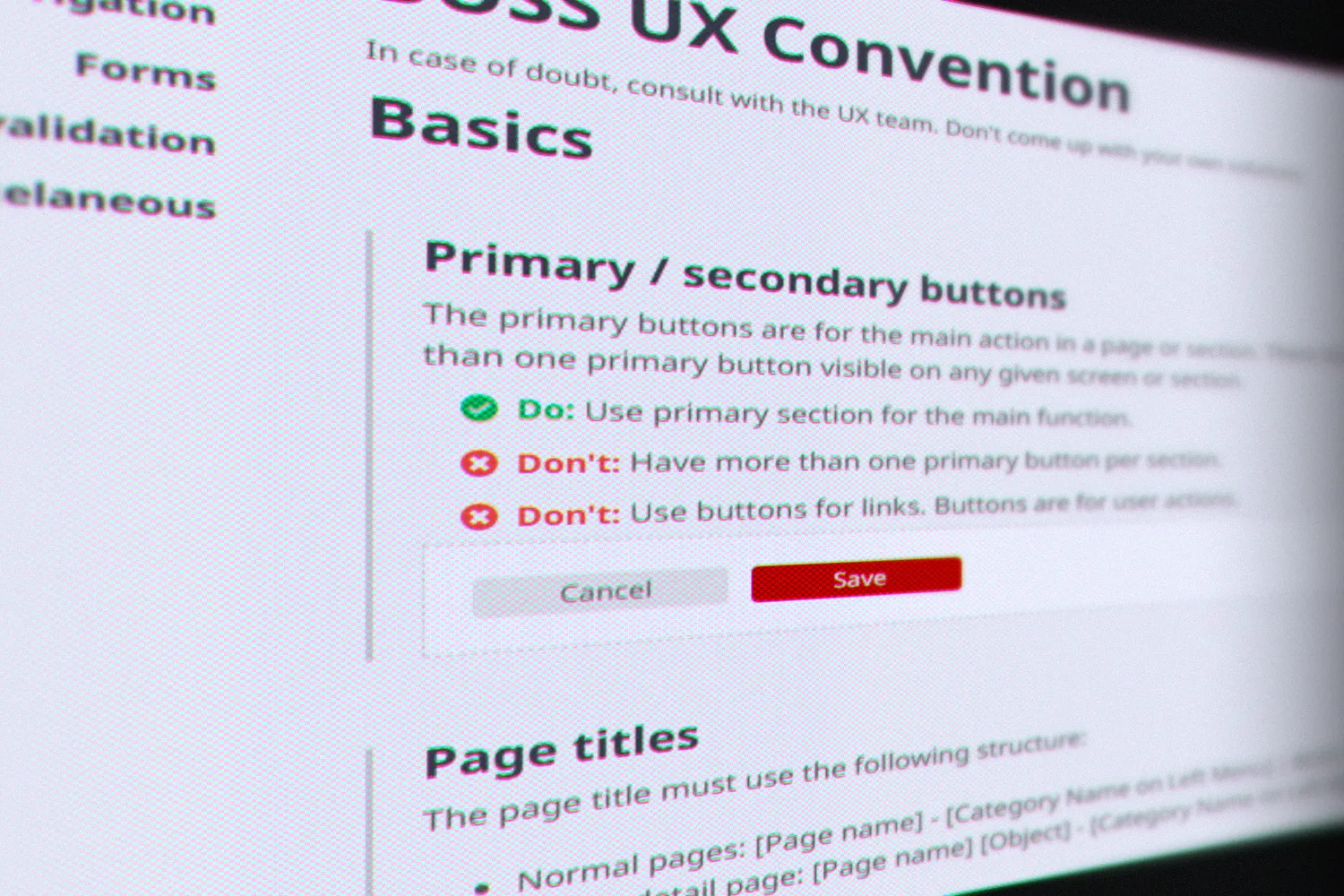
The library's documentation, here its UX conventions: how to use the components, and when.
Problem
BOSS was an old ASP.NET application whose interface hadn't been maintained in years, and it looked it. As an important part of Rakuten's ecosystem that was becoming unmaintainable, it was due for a full relaunch: a new tech stack, a complete redesign and new features. The engineering teams were being formed at the same time.
That was an opportunity and a risk. Starting from scratch meant we could build on a clean foundation. But front-end expertise across the engineering teams was thin: most engineers had little experience with CSS or JavaScript. And five teams building an 80-screen product in parallel ended up solving the same UI problems separately; at one point, the same component had been implemented four times, on four different pages. Without a shared library, the quality of each screen depended on whoever happened to build it.
Constraints: a dense, desktop-only professional tool, used entirely in Japanese, that also had to support Internet Explorer 11. The product wasn't Rakuten-branded, which gave us full freedom over its visual design.
Role & process
The design and product team had three people: me, as a hybrid product and UX designer, another designer, and a manager. I designed every component and wrote the original UI library myself.
Grown from real pages. The system started implicitly with the first pages we designed. I defined the foundations first (colours, typography, an 8-point spacing system), then the most basic components, then increasingly complex ones as the pages required them. Every component existed in Figma first, so when we built HTML mockups, coding the matching component was the natural next step. Because I maintained both the Figma library and the code, keeping them in sync was simple: design the page, build the mockup, and update the library whenever the page introduced something new.
Handing off code, not pictures. Our design deliverables weren't static images: they were working HTML and CSS mockups of each page. It's a practice I still believe in. Engineers receive real, production-grade markup instead of reinterpreting a picture, nothing gets lost in translation, and the design that ships is the design that was approved.
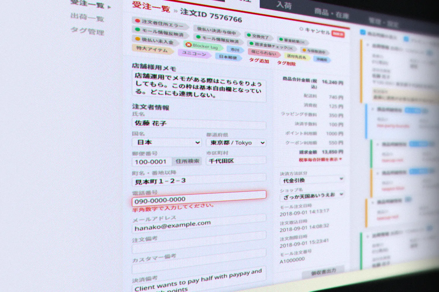
An HTML mockup of the order detail page, the kind of working page engineers received. Sample data.
Adoption by default. That handoff format is what made the library spread. It started inside the design team as the building blocks for our mockups, so when engineers took the mockup code, they were already using the library. The first components were simple, mostly HTML and CSS (buttons, fields), so there was nothing to resist. Then came components with a little JavaScript, like a slider or a "show more" toggle, and eventually very complex ones. By then, all five teams were already building from the same parts.
Making it official. Once the library matured, I ran a workshop for all the engineers: who the design team was, how to use the documentation, how the library helps, how versions work and how to reach us. It put everyone on the same page and made the library popular. From then on, new engineers were onboarded by their teammates, with documentation clear enough to stand on its own.
Lightweight by design. Rather than pulling in a UI framework or heavy libraries, I wrote the components from scratch. Later in the project, when the engineering teams adopted Vue.js, the design team, which by then had more capacity, rewrote every component in Vue.js, and the documentation moved to Storybook.
Solution
One library, three layers:
- Components: 90+ components, from basic form fields to complex data tables, documented on working HTML pages with live examples
- Coding conventions: shared rules for HTML, CSS and JavaScript (naming, formatting, avoiding style conflicts, the 8-point spacing system, semantic HTML and properly labelled inputs), so code from five teams read like one codebase. Main components were designed to meet WCAG AA.
- UX conventions: patterns for recurring situations, such as primary and secondary actions, saving and canceling forms, form validation, deletion and its confirmation, and empty states. Empty states distinguished, for example, between "no results for this search," "nothing created yet" and "no history to show," each with its own message.
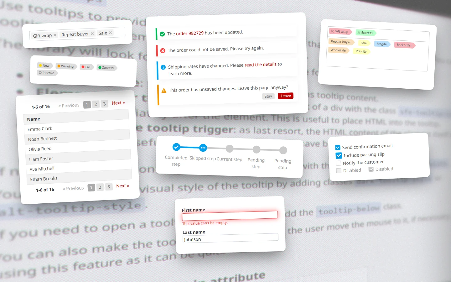
A handful of the library's 90+ components, rendered from the library itself. Sample data.
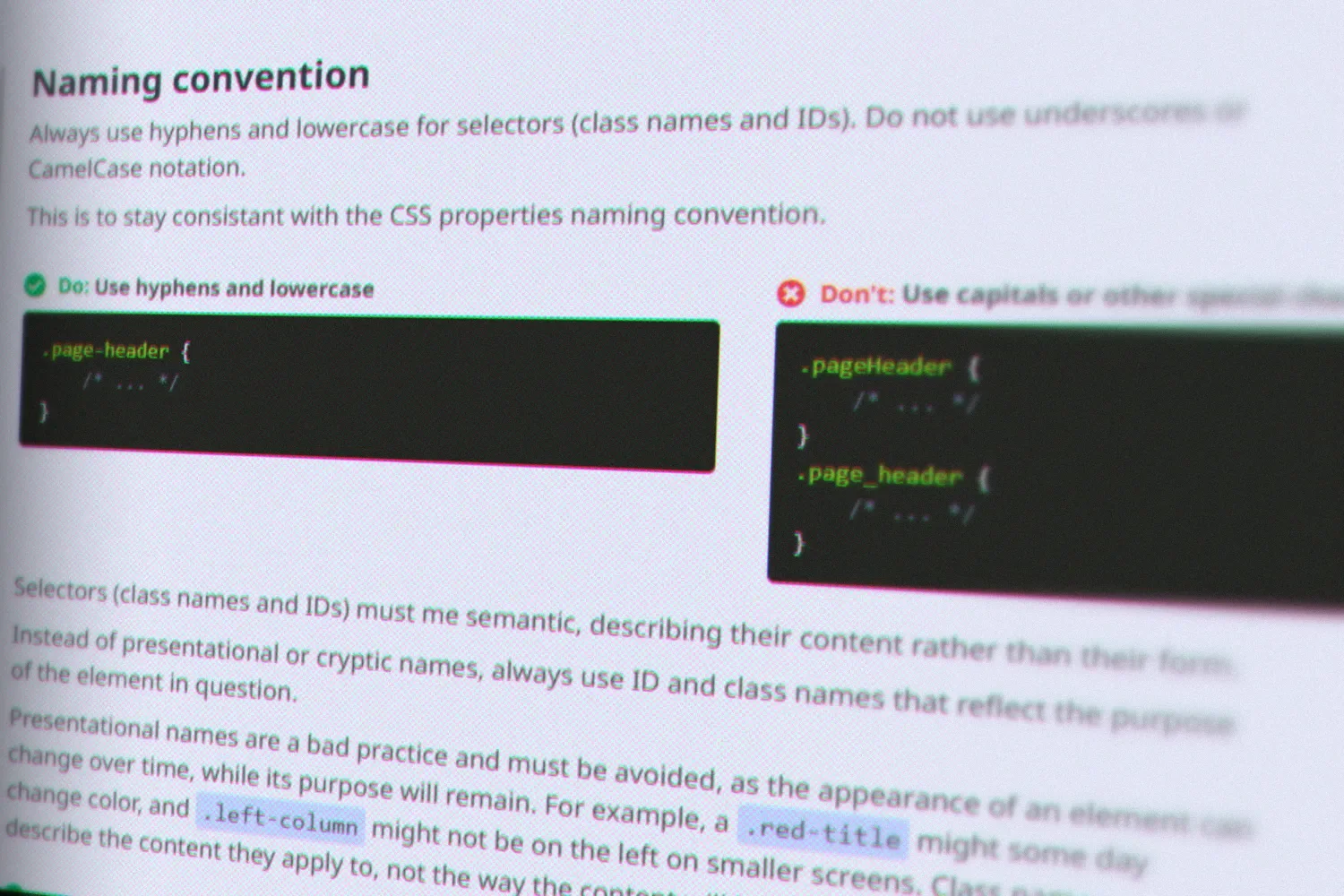
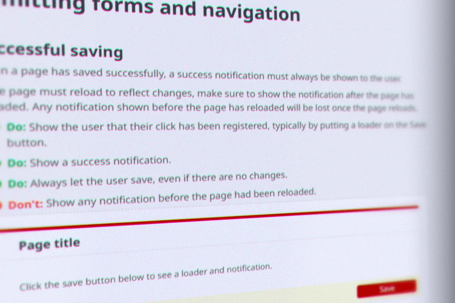
One example from each layer: the order table, the naming rules for CSS selectors, and the rules for saving a form. Sample data.
Markup-driven components. Every class carries an sfe- prefix, so the new
library could live alongside legacy styles without conflicts. Variants and
states are plain modifier classes (sfe-button primary, compact,
disabled, loading), and behaviour attaches automatically: on page load,
the library scans the markup and initialises every component it finds, with
options set through data attributes. Engineers didn't need to write
JavaScript to open a modal or paginate a table; they wrote HTML. That's why
handing off HTML worked so well: the mockup's markup was already the
implementation.
The only CSS in the app. Engineers weren't supposed to write any CSS of their own. Every style came from the library, which is what kept 80+ screens built by five teams consistent. It also took front-end skill out of the equation: engineers assembled ready-made components instead of writing their own CSS and JavaScript, so the quality of the UI no longer depended on who built the page, and every page looked and behaved the same way. Each component was built once, instead of once per team.
Because every style came from one namespaced library, the look of the entire product could change with a single stylesheet, which let BOSS be relaunched gradually, screen by screen, without sellers ever seeing two designs at once (see the BOSS redesign).
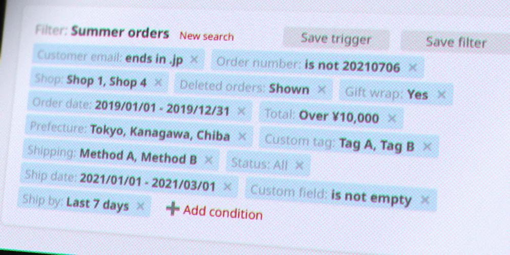
Beyond the basics. Alongside buttons, fields and modals, the library included a wizard, record cards, an announcement bar, empty states and other components shaped by the product's needs:
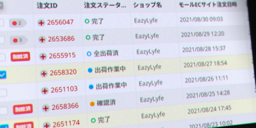
Flex table
A powerful table built on CSS flexbox, with resizable and reorderable columns, sortable rows, data filters, a sticky header and action bar, inline details and actions, loading states and a JavaScript API (see the side quest below).
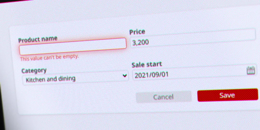
Form components
Text fields, dropdowns, checkboxes, date and date range pickers and more. Errors appear right below the field that needs fixing.
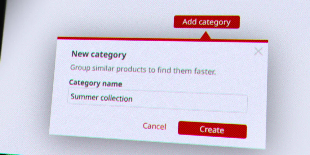
Contextual modal
Opens right next to the element that triggered it, above or below depending on the space available, without darkening the screen, so it doesn't break the user's flow. If it contains a field, that field is focused automatically, saving a click. Like most components, it works without writing any JavaScript.
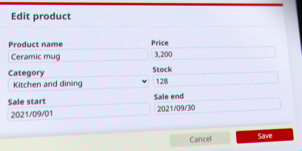
Action bar
Stays sticky at the bottom of its container while scrolling, keeping the main actions within reach on tables and long forms.
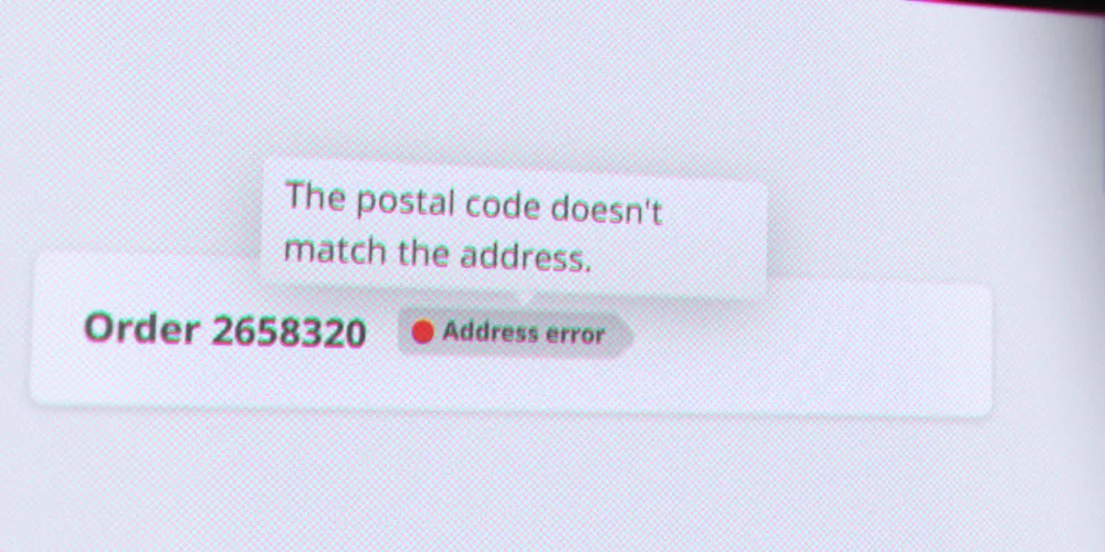
Tooltip
Adds contextual details on hover to most elements, such as tags, buttons and links. The content can be plain text or HTML, and the tooltip can open above or below its target.
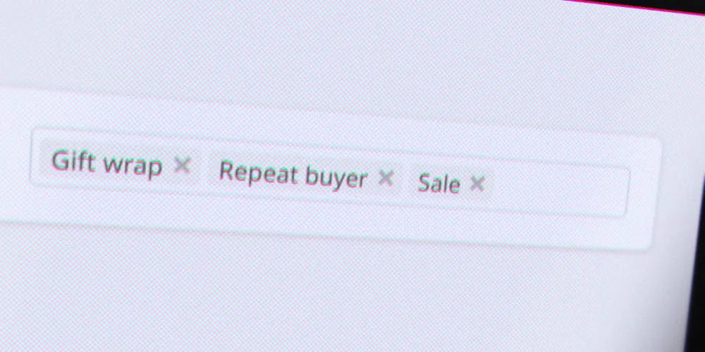
Token field
Type a value and press Enter or a comma to turn it into a token, with an optional limit on the number of tokens. Under the hood, the tokens are stored as plain comma-separated text in the original field, so forms keep working as if it were a normal input.
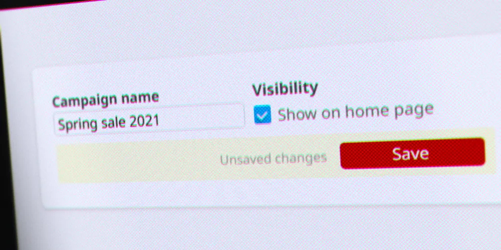
Unsaved changes tracker
Warns before leaving a page with unsaved edits, including changes made by adding, removing or reordering table rows.
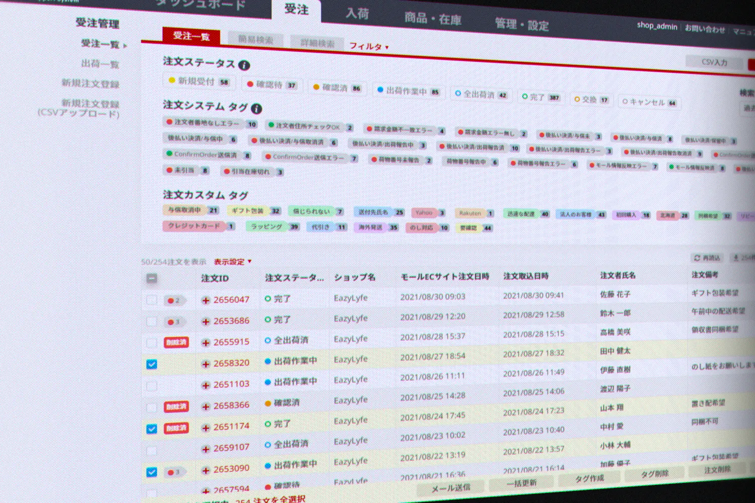
- 1Configurable columns
- 2Expandable inline details
- 3Row selection
- 4Action bar for bulk actions
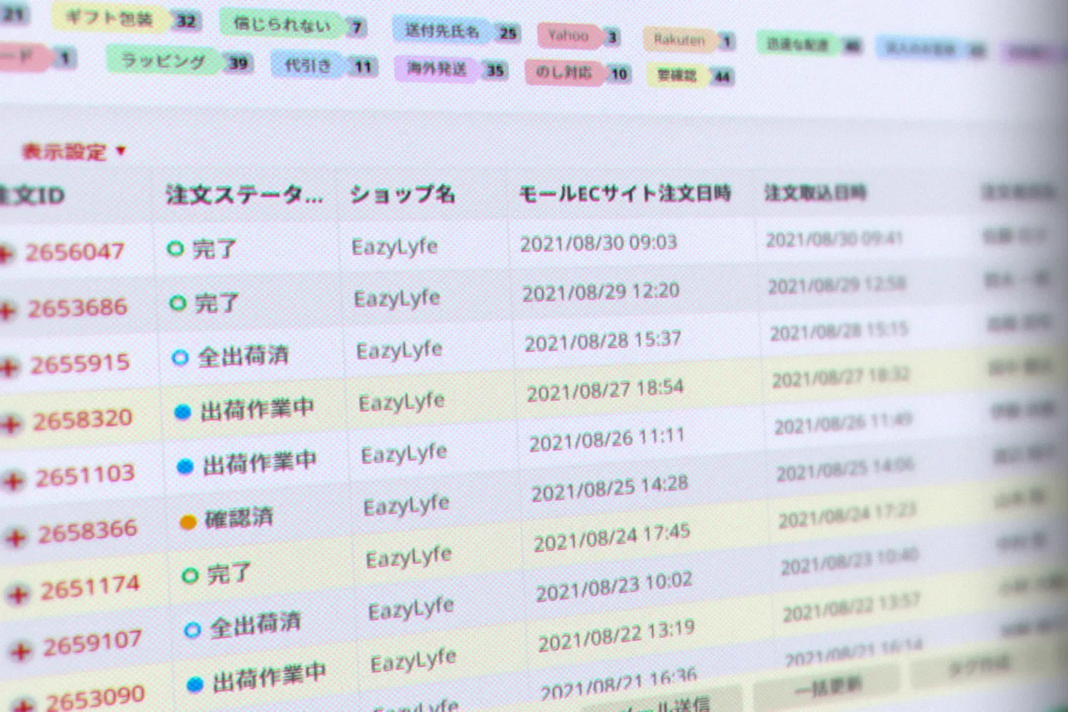
The order list, BOSS's main screen and the toughest test of the table components. Sample data.
Versioning without breaking changes. The library lived in a Git repository that every team could check out, and each release was versioned and logged in a changelog, so features could declare what they needed ("this requires at least version 2.0.3"). Over three years, from version 1.1 to 2.0.19, it shipped 62 releases without a single breaking change. When tables needed a fundamentally different architecture, I didn't rewrite the existing component under everyone's feet: I created a new one, the flex table, alongside the original. Product-specific logic was progressively moved out of the library, keeping it generic.
Replacing heavy dependencies. Building our own components let us remove a handful of heavy third-party libraries, most notably jQuery UI and DataTables. The library came to 67 KB of minified JavaScript, replacing 540 KB of libraries and dependencies: an 88% reduction. The app loaded faster, and we gained full control over every feature and every pixel.
Third-party libraries and dependencies, 540 KB
The UI library, 67 KB
Minified JavaScript, drawn to scale.
Taming the data table
Sorting, filtering, grouping, dragging and bulk actions on hundreds of orders at once: the table was the library's hardest component.Side quest
In an order management tool, the table is the product. Sellers live in lists of orders, items and shipments, so the table components had to do a lot: sorting, column filters, resizable and reorderable columns, user-configurable column layouts, pagination, expandable inline details, inline actions, row groups, drag-and-drop rows, and row selection with an action bar for bulk operations. On wide tables, the header, footer and action bar stayed in place while scrolling horizontally.
Its toughest test was the order list, BOSS's main screen: a dense view with dozens of functions, displaying hundreds of orders at once without any performance issues.
Tables were by far the hardest part of the library to build, with a whole section of the documentation to themselves, and one of the most fun. Building them ourselves instead of relying on DataTables is a big part of how the library stayed small while doing more.
Outcome / impact
- 90+ components designed, coded and documented, powering 80+ screens
- 100% adoption: every piece of front-end UI in the app came from the library, across 5 engineering teams
- Visual and functional consistency across pages: with front-end skill out of the equation, every page looked and behaved the same way, no matter which team built it, and teams stopped rebuilding the same components separately
- 88% less UI JavaScript: 67 KB instead of 540 KB of third-party libraries, for faster load times
- 62 releases, zero breaking changes: engineers could request changes or report issues at any time, and fixes shipped as new versions ("fixed in 2.0.3")
- Faster design: smaller pages needed no new components at all, so they could be designed and mocked up very quickly
- Full control: no more working around third-party libraries' features and styling
- A foundation for the relaunch: the library underpinned the BOSS redesign, a product used by more than 5,000 businesses by the time I left, and 8,500+ today
Reflection
BOSS was my first large-scale design system, and the most important lesson I carried into the next one was that patterns and language belong in the system. At BOSS, interaction design guidelines and UX writing advice lived in separate documents that were easy to miss. At ZAIKO, interaction design guidelines, voice and tone, and copywriting guidelines in Japanese and English were part of the design system from the start, maintained alongside the components.
Live project
BOSS UI Library
Open every component and try it. A snapshot from 2021.