All work
Creator Hub design system
Unifying a dozen design languages under one system for UI, interaction design guidelines, content and DesignOps.
See it liveFacts
- Company
- ZAIKO
- Role
- Product owner, Lead UX designer
- Timeline
- 2021–2025
- Duration
- About 2 years, gradual rollout
- Team
- Design system lead, 1 designer on initial visual direction, 0–5 engineers depending on priorities
- Tools
- Figma, Figma variables, Storybook, Jira, Notion, Vue, Vite
- 37
- reusable components
- 5
- layers, from components to DesignOps
- AA
- WCAG accessibility target
At a glance
- About 12 inconsistent design languages, replaced step by step by one shared system of 37 reusable components
- Beyond UI: shared interaction design guidelines, a bilingual voice and tone, and DesignOps processes, so consistency covered how we wrote and worked, not just how things looked
- WCAG AA accessibility, held even on pages where organisers choose their own brand colours
- Product managers could prototype new pages without a designer
Overview
When I joined ZAIKO, its UI had grown without a shared foundation. I initiated and led Creator Hub, ZAIKO's design system, across both sides of the product: the public pages where fans discover events, buy tickets, join subscriptions and read the blog, and the logged-in back office where organisers manage their events, sales, data and profiles.
It grew into five layers: visual foundations and components, interaction design guidelines, content guidelines in Japanese and English, a shared set of realistic sample data, and DesignOps processes for our cross-functional team. It became the foundation for every redesign that followed, including the ticket funnel, the pages that carry nearly all of the company's revenue.
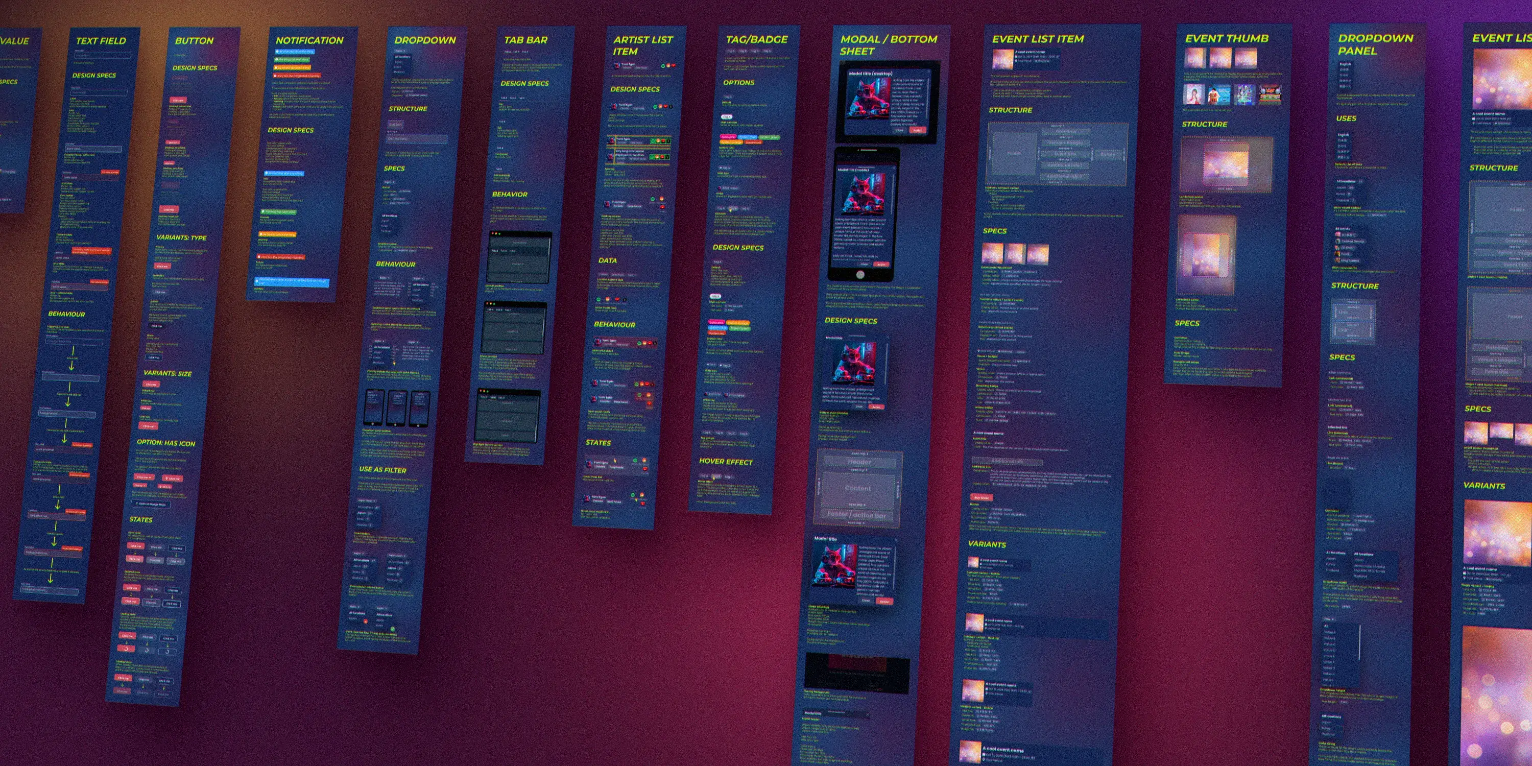
Creator Hub's component specs in Figma: every component with its states, design specs and behaviour.
Problem
I counted about 12 different design languages across ZAIKO's product. The public-facing side alone had three: one built by an external agency, a Bootstrap theme assembled by engineers, and others in between. A buyer moving from the homepage to an event page to their account saw what looked like three different products; the account page was little more than a bare Bootstrap template.
One buyer journey, three different-looking products. Reconstruction, not screenshots.
None of these was a real system with defined, reusable components. Pages were designed and delivered one by one, every new page meant imitating whichever look was nearby, and implementations were often inconsistent. The inconsistency went beyond visuals: interface copy in both Japanese and English varied in quality and contained avoidable errors and awkward phrasing, and similar problems like form errors or empty screens were solved differently on every page.
Constraints:
- No dedicated team. The system was built in the background, with zero to five engineers available at any time depending on other priorities.
- No big-bang redesign. Leadership preferred to invest in new features rather than redesign existing pages, so the system had to spread through new work and major redesigns rather than a rewrite of everything.
Role & process
Making the case. I advocated for a design system for a while before it gained traction. The turning point came with the redesign of organisers' public pages: instead of building them page by page like before, I pushed to start clean on a proper design system, which became Creator Hub. My argument was that the system would cost more upfront but save far more later, and make the product better along the way.
Foundations. Another designer had created polished static mockups of the first pages, setting the visual direction. I distilled them into the system's foundations, starting with primitives and design tokens, then built up the first components from there.
The component loop. For each new need, I worked out the requirements with the team, designed the component in Figma with all its states and specs, reviewed it with engineers to make sure it was sound to build, and handed it over through Jira for implementation. I handled visual QA myself, checking each implementation against the spec, since catching small deviations in spacing, alignment and states takes a designer's eye.
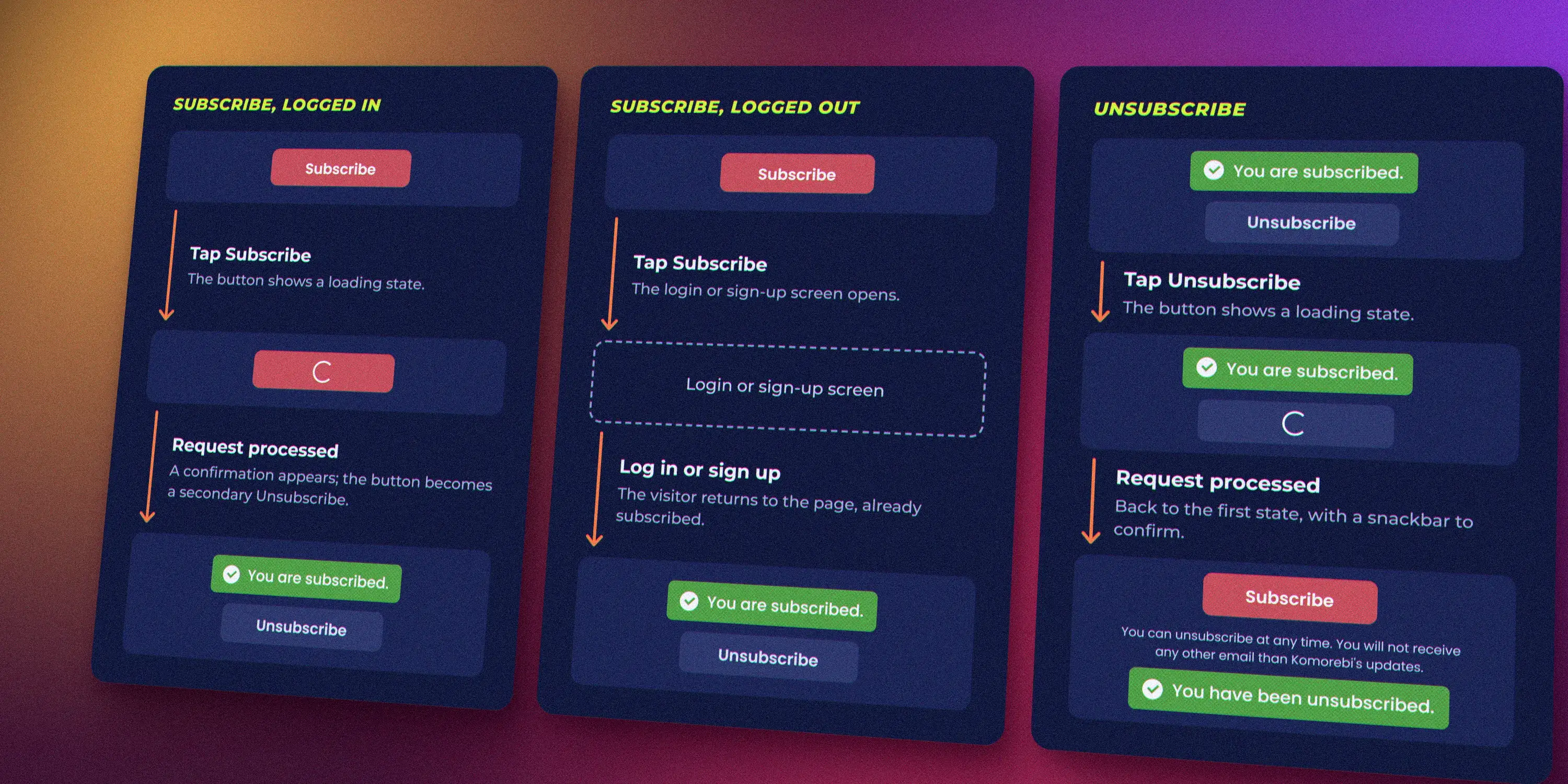
The newsletter component's three flows, redrawn from its interaction spec in Figma. The artist name is fictional.
Winning adoption. What convinced people most was a demonstration: once the first components existed, I showed how quickly anyone, including non-designers, could prototype a new page with them. Seeing it work did more than any argument about long-term savings.
Rollout. Adoption was gradual, over about two years from the first discussions to components shipping on real pages. Starting from organisers' public pages, it cascaded to the event pages and the ticket funnel in mid 2024, and into the organiser back office.
Solution
A component library alone makes screens look alike; it doesn't make a product feel coherent. The system covered five layers.
1. Foundations and components
- Figma library: design tokens and every component with its specs. Colours were built with Figma variables, a brand-new feature at the time, mapped one-to-one to CSS variables in the front end.
- Coded component library: Vue components built with Vite by the engineering team and documented in Storybook
- Jira project: the bridge between design and code. Every component started as a ticket, and every change followed the same path: I updated the component in Figma, then opened a Jira ticket describing the change precisely for engineers to implement. Figma, then Jira, then code, every time.
- Figma library
- to Jira ticket
- to Coded library
-
1
At Figma library: Designed firstEvery component and every change started in Figma, with its states and specs.
-
2
At Jira ticket: Described preciselyA ticket told engineers exactly what to build or change.
-
3
From Coded library back to Jira ticket: Visual QAI checked each implementation against the Figma spec and reported deviations back on its ticket.
Every component change took the same path, with the Jira ticket as the bridge between design and code.
The library ranged from basics, such as buttons, text fields, accordions, notifications and key-value pairs, to complex, domain-specific components: artist lists with pictures, genres and social links, event lists with context-dependent variants, ticket lists covering every edge case of ZAIKO's events, and a modal that becomes a bottom sheet on mobile.
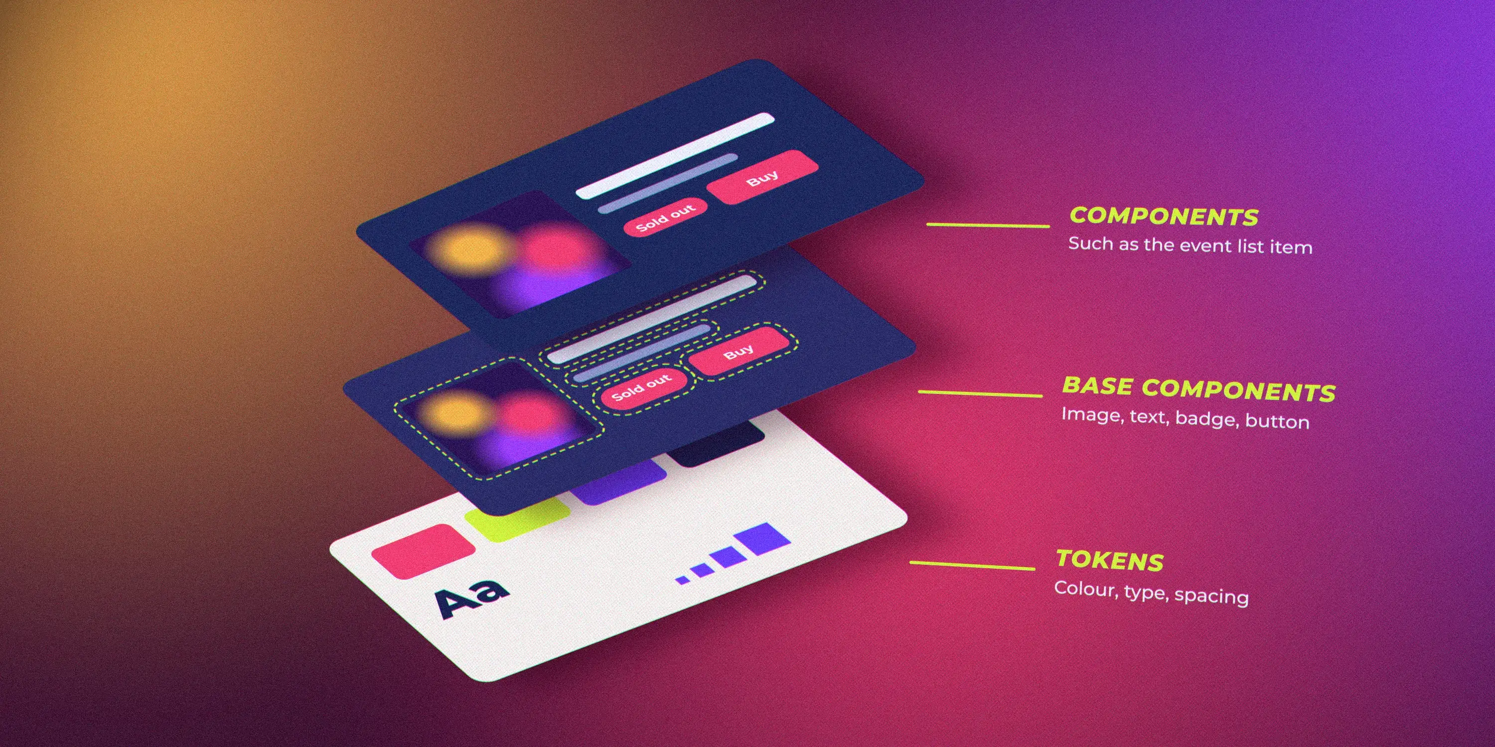
How the library was layered: tokens, then base components, then components such as the event list item. An illustration.
The humble date component
Single dates, time ranges, timezones and five languages: why one small component was worth getting exactly right.Side quest
Dates look simple until they have to work for every event in five languages. ZAIKO's datetime component handled single dates and time ranges, showed the timezone whenever one was available, and followed each language's conventions, down to the range separator: a wave dash in Japanese, an en dash in English. Ranges stayed short: an event ending within 12 hours didn't repeat its date, and the year only came back when the end was more than six months away and in a different year. It also covered cases specific to events, such as a start time still to be announced, or late-night times written past midnight as 26:00.
| Case | English | Japanese |
|---|---|---|
| Date only | Oct 31, 2025 (Fri) | 2025年10月31日 (金) |
| With timezone | Oct 31, 2025 (Fri) 19:00 JST | 2025年10月31日 (金) 19:00 JST |
| Ends within 12 hours | Oct 31, 2025 (Fri) 19:00 – 2:00 JST | 2025年10月31日 (金) 19:00 〜 2:00 JST |
| Ends on another day | Oct 31, 2025 (Fri) 19:00 – Nov 1 (Sat) 15:00 JST | 2025年10月31日 (金) 19:00 〜 11月1日 (土) 15:00 JST |
| Ends 6+ months later, new year | Oct 31, 2025 (Fri) 19:00 – May 1, 2026 (Fri) 15:00 JST | 2025年10月31日 (金) 19:00 〜 2026年5月1日 (金) 15:00 JST |
A preview of the rules, not the full set.
Encoding those rules once in a component meant no page ever had to reinvent them, or get them subtly wrong.
Reuse before creating. When another designer requested a new component, we first discussed whether an existing one could do the job, and it often could. Each new component costs design, engineering and maintenance time, so single-use components were off the table. When a new component was justified, I designed it to be as versatile and reusable as possible. This discipline kept the system small, coherent and affordable to maintain.
Accessibility built in. The system targeted WCAG AA, a clear step up from the sites it replaced: readable font sizes, comfortable touch targets, visible focus states and, especially on forms, clear validation and error messages.
Brand colours vs. accessibility
How organisers kept full control of their brand colours while every page still met AA contrast.Side quest
ZAIKO is white-label: organisers can set their page's background, text and accent colours to match their brand. That's great for brand identity, and a risk for accessibility: some colour combinations made content hard to read.
I designed the colour customisation feature. Because colours were design tokens, mapped to CSS variables, organisers could change them without touching any component, and see the result in a live preview as they went. To hold the AA target without taking that freedom away, combinations below the minimum contrast triggered a validation error, with the option to adjust the colours automatically.
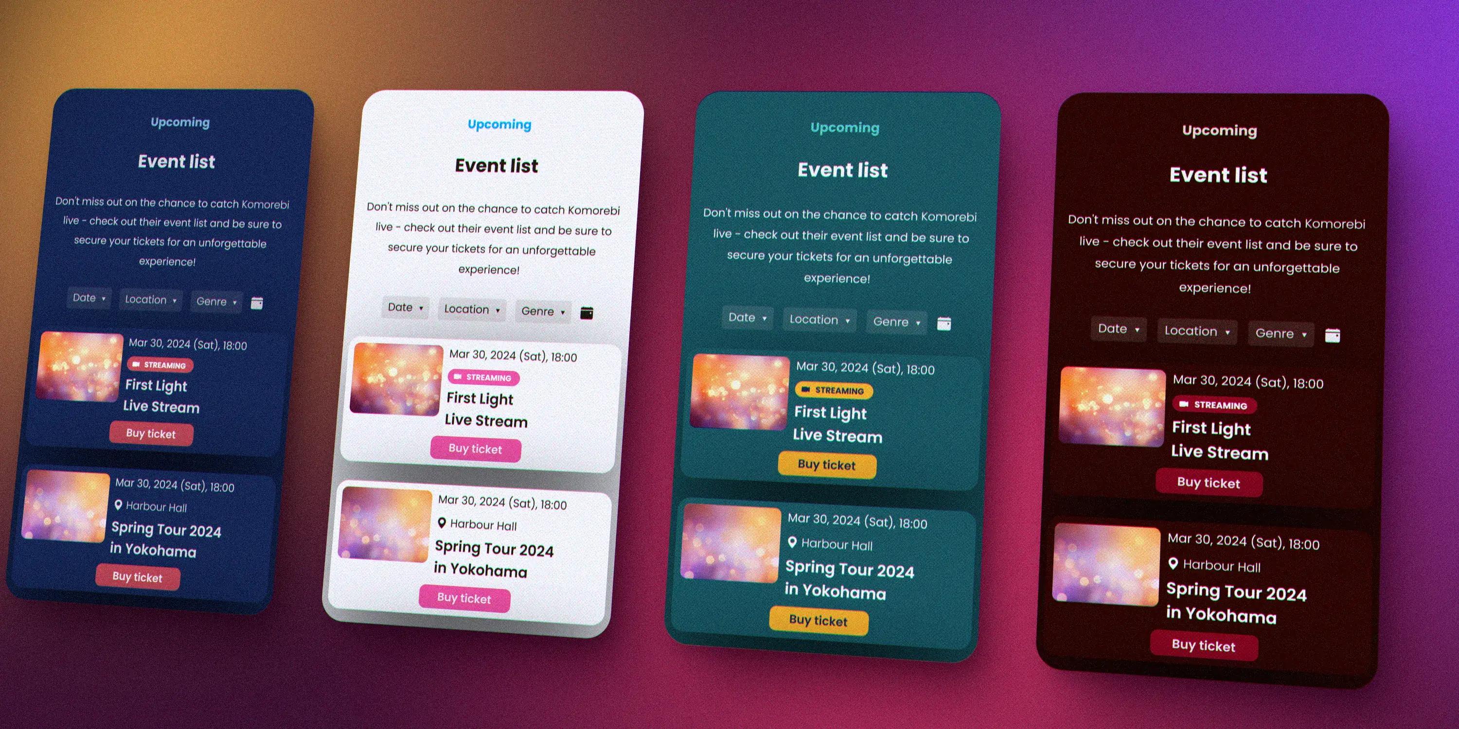
The same event list in four colour palettes, from the Creator Hub Figma library. Event names are fictional.
To make good palettes easy, organisers could also extract their brand colours from an image using AI, and some event pages automatically took their colours from the event flyer. Every page could look a little unique, while staying readable for everyone.
2. Interaction design guidelines
Shared rules for recurring interaction problems, so each team didn't solve them differently:
- Form validation and submission behaviour
- Writing and displaying error messages
- When and how to use empty states, and how to word them
- Handling long text
- Formatting dates, numbers and other locale-dependent values
- Choosing icons
- General dos and don'ts
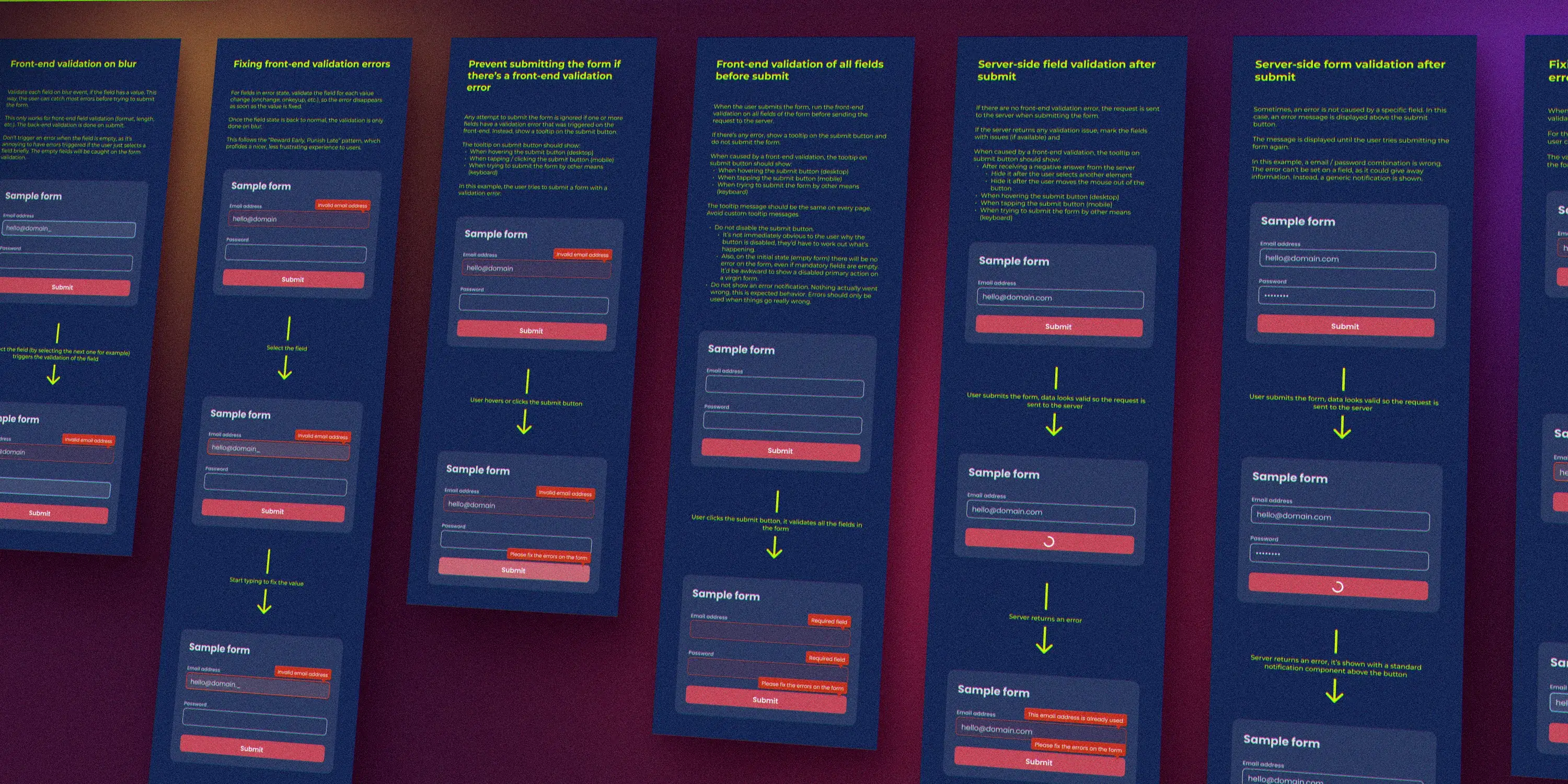
The form validation guidelines in Figma: seven rules, from validating a field on blur to showing server errors, each shown step by step on a sample form.
3. Content: voice, tone and copywriting
A defined voice and tone for ZAIKO, plus company-wide copywriting guidelines in both Japanese and English. They gave everyone writing interface text a shared reference to avoid common mistakes and phrasing that could come across the wrong way.
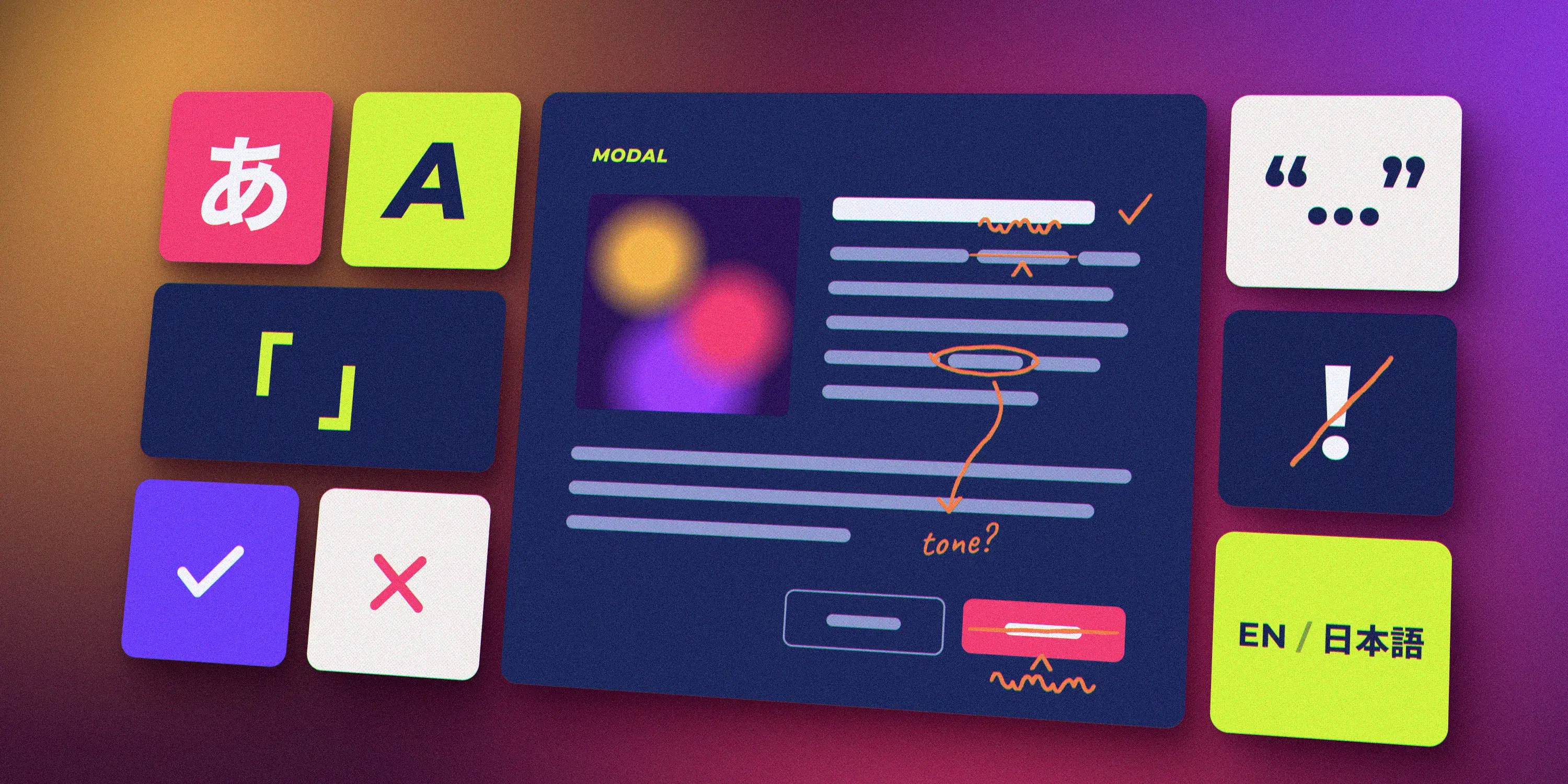
What the copywriting guidelines covered, from voice and tone to punctuation in both languages and the wording on buttons. An illustration, not a page from the guidelines.
4. Realistic sample data
A shared set of sample content (event images, artist names, user names and profile pictures) for designing pages. Realistic data exposes layout problems that placeholder text hides, and it kept mockups across designers consistent.
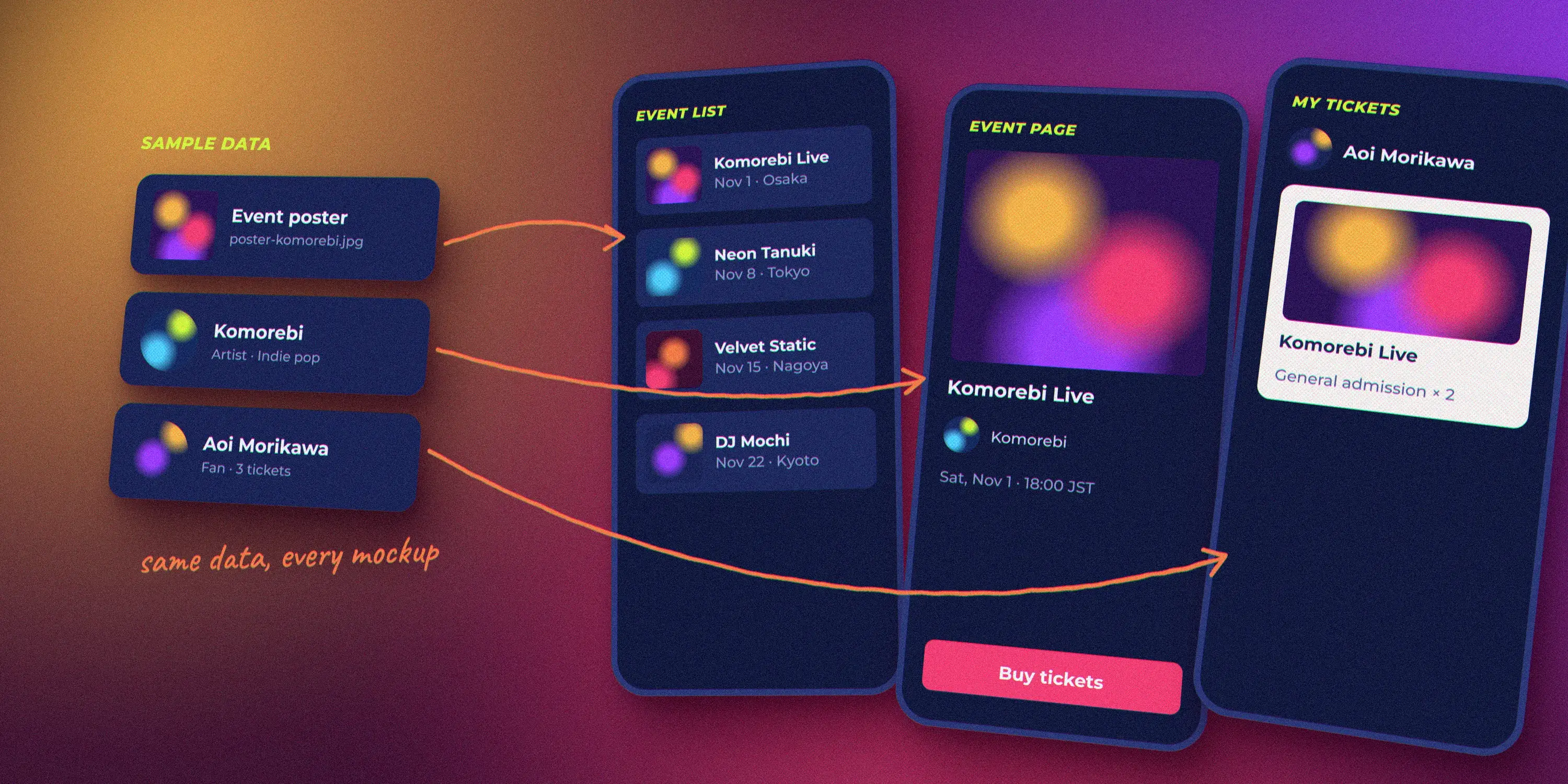
One set of sample content, reused in every mockup. An illustration; names and events are fictional.
5. DesignOps: ways of working
Processes for how our cross-functional team worked together: how to start and close projects, how to structure Figma files so they stayed navigable, and how to hand off design changes to engineering. Clear processes made collaboration smoother and new team members faster to onboard.
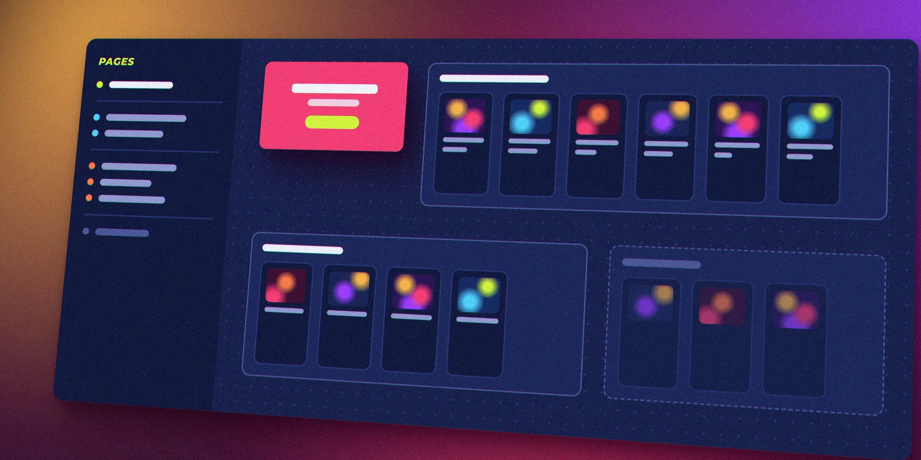
The idea behind a navigable Figma file: pages grouped by status, a cover, and frames in labelled sections. An illustration, not a real file.
For more on how I build cross-functional processes, see Building cross-functional processes at Rakuten.
Who it served
Each layer had its own audience, and lived where that audience already worked.
| Layer | Design | Product | Engineering | Everyone else |
|---|---|---|---|---|
| 1 Foundations and componentsFigma, Storybook | Yes | Yes | Yes | No |
| 2 Interaction design guidelinesFigma, Storybook | Yes | Yes | Yes | No |
| 3 Voice, tone and copywritingNotion, pinned in Slack | Yes | Yes | Yes | Yes |
| 4 Realistic sample data | Yes | No | No | No |
| 5 DesignOps processesNotion | Yes | Yes | Yes | No |
The system's five layers and the teams each one served.
Outcome / impact
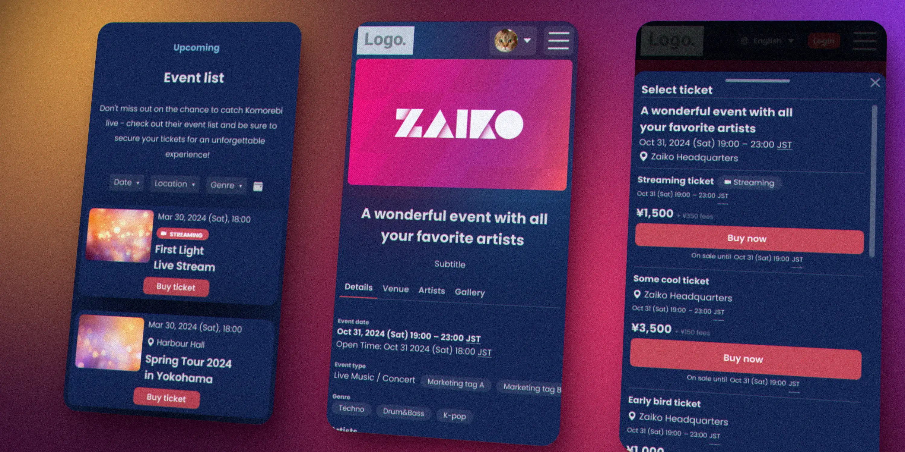
The same buyer journey in Creator Hub: one design language from the organiser's page to the ticket drawer. From the Figma designs; event names are fictional.
For fans and organisers
- One design language for the core buyer journey. By the time I left, the system covered the most important pages, from organisers' public pages to the ticket funnel, and was being rolled out further as new work came in. Some legacy pages remained on older styles, as redesigning them wasn't a business priority.
- Accessible by default: WCAG AA as the baseline, including on pages customised with organisers' own brand colours
For the team
- Pages without a designer: product managers prototyped pages such as back-office forms in Figma using the system's components. As long as they used standard components, engineers could build them without any extra specs. One product manager told me how much it changed their work: no more waiting for a designer to become available.
- Faster from idea to production: designers and engineers built from the same ready-made parts, and specced components left less room for interpretation during development
- Consistent output: work from different designers looked and read like one product
- Smoother collaboration and onboarding: shared processes reduced friction between design and engineering and helped new people get up to speed
For the business
- Higher-quality UI at a lower cost, with less time spent redesigning and rebuilding the same things
- A foundation for bigger projects: the system made the ticket funnel redesign possible, which raised conversion by 1.5%
See it live
The Labyrinth 2026, an organiser's event page built on Creator Hub. A three-day festival with multiple ticket categories, sold-out tiers and parking add-ons, it shows the system handling one of ZAIKO's most complex event types.
Reflection
The system ended up spread across Figma, Storybook and Notion, wherever each audience already worked. I had wanted a single documentation site bringing everything together, but the company didn't have the resources for it at the time. Next time, I'd push for a single home from the start, even a lightweight one. A system people can't find is a system they don't use.