All work
Ticket funnel redesign
Moving the pages that carry nearly all of ZAIKO's revenue onto a new design system, then improving them with evidence.
Facts
- Company
- ZAIKO
- Role
- Product owner, Lead UX designer
- Timeline
- Mid 2024
- Duration
- A few months, plus ongoing A/B testing
- Team
- Sole product/UX lead, 3–4 engineers, input from product and sales
- Tools
- Figma, Jira, PostHog
- +1.5%
- conversion
- UX redesign
- +60%
- search engine traffic
- SEO improvements
- +2%
- average order value
- Upsell redesign
At a glance
- +1.5% conversion from the redesigned funnel, measured in a head-to-head A/B test against the old one
- +60% traffic from search engines within 3 months of rebuilding the event pages' SEO
- +2% average order value from redesigned upsells on the same checkout
Overview
ZAIKO is a Tokyo-based ticketing platform for event organisers: concerts, club nights, festivals and, since 2020, ticketed livestreams, a format it pioneered in Japan. Organisers use it as a white-label storefront to sell directly to their fans, with multi-language and multi-currency support for international audiences.
The ticket funnel is where almost all of that revenue happens. It starts with the event page (event details and available tickets), followed by checkout and payment, and it sells both in-person and livestream tickets. For most visitors, the event page is also their first contact with ZAIKO.
I advocated for the funnel to be the next milestone of the Creator Hub design system rollout, then led it end to end: discovery, design, specification, rollout and the company's first A/B tests.
Problem
We had started rolling out the new design system on lower-traffic pages. That left buyers switching between two different design languages in the middle of a purchase, which is exactly the moment where trust matters most. Fixing that was the main driver.
The funnel also ran on an older tech stack that had to be migrated anyway, and it had accumulated friction that hit buyers directly:
- Mobile was underserved. Over 90% of traffic came from mobile, and we saw considerable drop-off at every step of the mobile funnel.
- Fees appeared only at the last step, frustrating buyers right before payment.
- Upsells were hard to use. Subscriptions, merchandise and tipping on the second checkout step had poor UI, leaving revenue on the table.
- Noise and rough edges. Physical-event tickets repeated the venue name on every ticket, and some edge cases didn't display properly.
- Weak SEO. Event pages had generic metadata and no structured data, and weren't getting the search traffic they could.
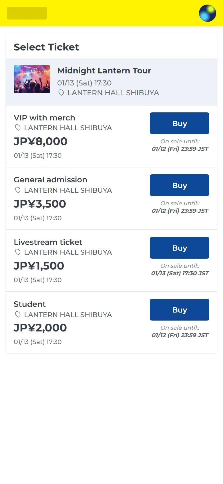
- 1Venue repeated on every ticket
The old ticket list. The venue appears once for the event and again on every ticket, and prices show no fees. Redrawn with a fictional event.
Challenge: one page, many kinds of events. The same event page has to sell a multi-day festival with dozens of ticket types, a tour across several venues, a livestream with a single ticket, or a video on demand. Every component had to work across all of these without the page feeling generic for any of them.
Constraint: feature parity. The new funnel had to do everything the old one did, no more. The goal was a better experience, not new functionality.
Goal: measurably lower drop-off at each step of the funnel.
Role & process
I secured leadership buy-in for the project, then led it from discovery to post-release optimisation. I was the sole product and UX lead, with occasional input from product colleagues. A team of 3–4 engineers handled implementation, and the sales team was involved at the start and at launch.
Discovery and alignment. I ran ideation sessions and one-on-ones with leadership, engineering and sales to surface pain points, then turned them into a scope statement and a prioritised list of improvements.
Design and specification. I designed the pages and every new design system component they needed in Figma, documenting all states and edge cases. With festivals, tours, livestreams and video on demand all flowing through the same pages, the edge cases were endless, so I partnered with a long-tenured product colleague who knew every one of them. Each component was then specified in Jira, which grew the design system and the funnel at the same time.
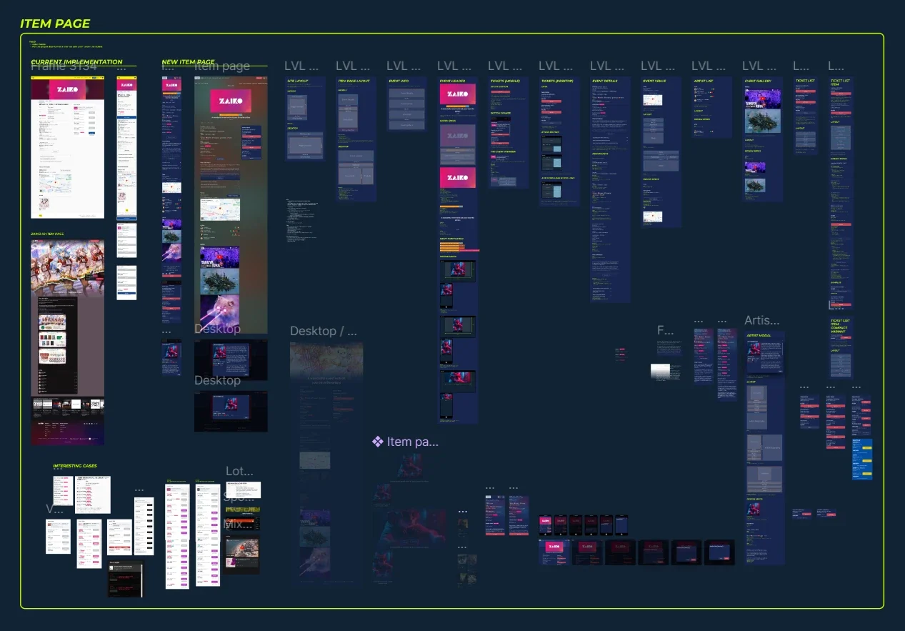
The event page workspace in Figma: the current implementation, the new page, specification boards and a collection of edge cases.
Validation. I tested clickable prototypes internally, with selected clients and with people outside the company, and iterated on the design with the stakeholders from discovery.
Build. Rather than reviewing only at the end, I stayed embedded with the front-end team through weekly check-ins and ad-hoc calls, resolving questions and newly discovered edge cases as they came up. Before release, I handled the visual QA of the implemented pages myself.
Gradual rollout. After notifying clients, we released to 5% of users first, then expanded step by step until we were confident enough to switch everyone over.
Measure and iterate. I monitored analytics, logs and anonymised session recordings, and led ZAIKO's first A/B tests: first the new funnel against the old one, then a series of smaller refinements on the new pages. I chose what to test, analysed the results and decided what to ship. It moved our product decisions from opinion to evidence.
Solution
A funnel built from the design system. Features stayed 1:1, so the core work was structural. I broke the event page and checkout down into components and designed each one in the design system to cover every state and edge case the funnel could produce. The pages were then assembled from those components. The funnel now matched the rest of the product, inherited the system's accessibility improvements such as more accessible colours and font sizes, and later changes became component updates rather than page rewrites.
 Enlarge image
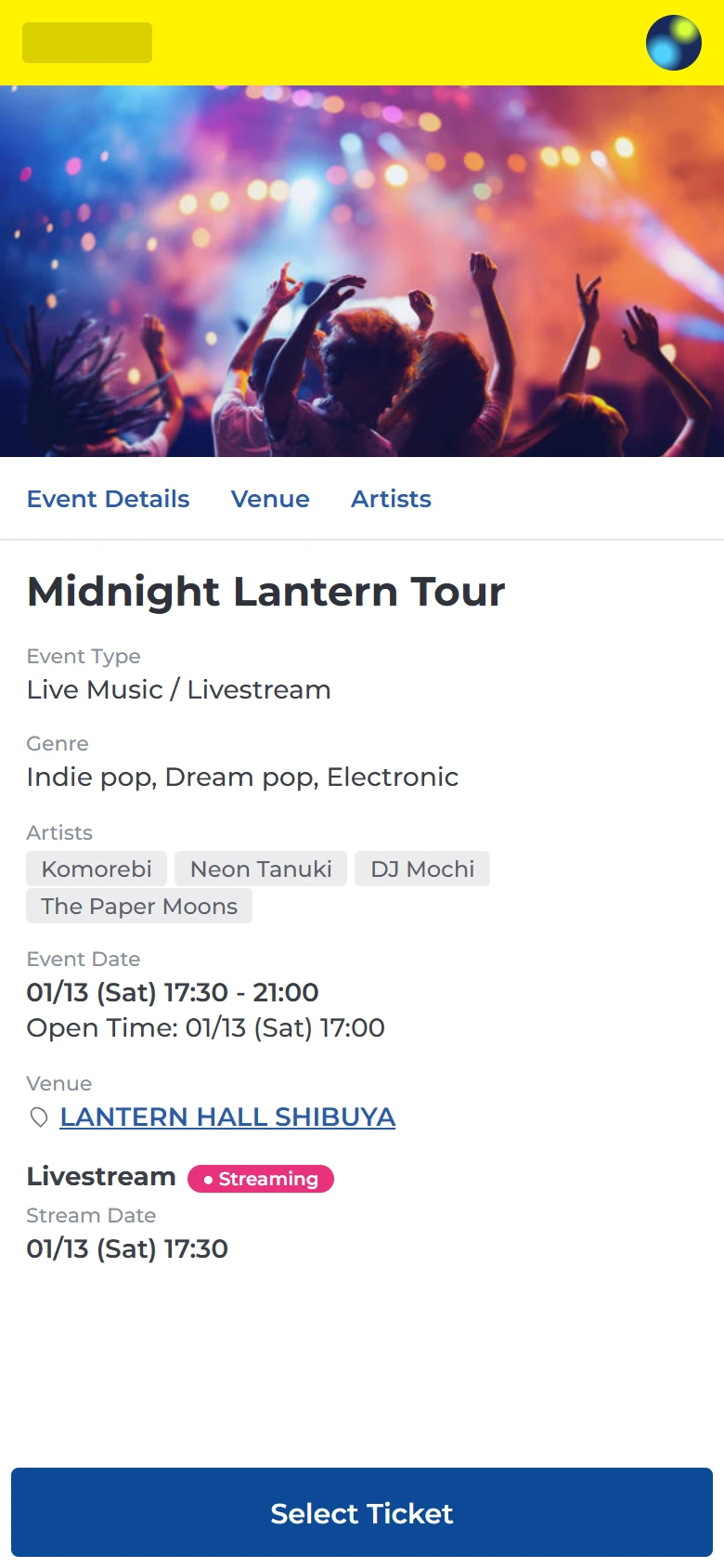
Before
 Enlarge image
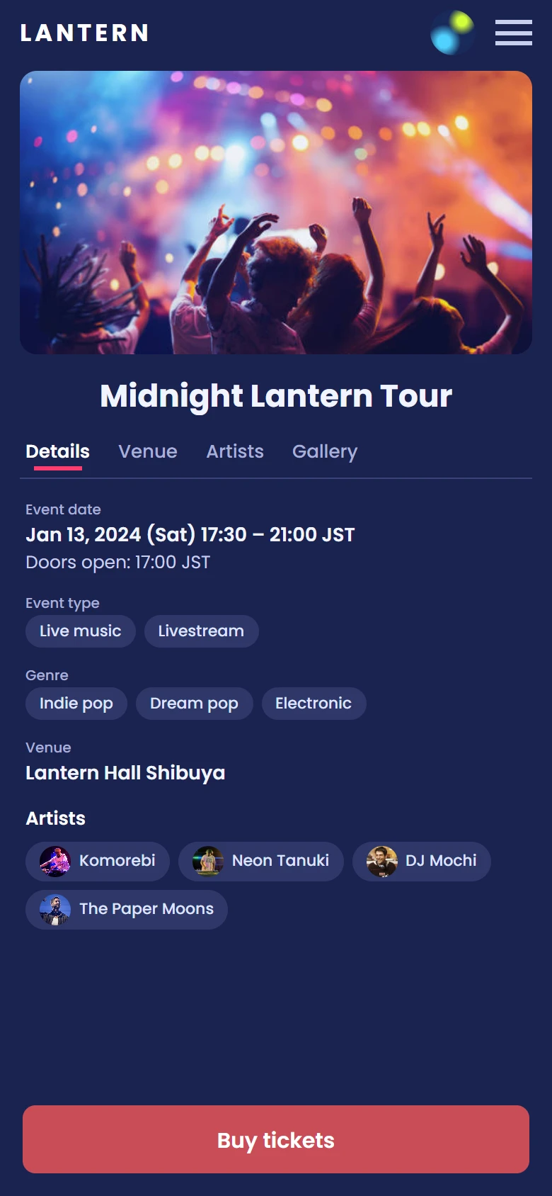
After
The mobile event page, before and after, redrawn with a fictional event.
Mobile first. With over 90% of traffic on mobile, every component was designed for small screens first.
Friction removed within scope. The redesign dropped the repeated venue name and fixed edge cases that displayed poorly.
Search-ready event pages. Every event page got a clearer title, richer metadata, a description automatically summarised with AI to the ideal length for search result snippets, and JSON-LD structured data so search engines could understand the event details.
Refining with A/B tests. Changes that could plausibly affect conversion went through A/B testing rather than debate:
- Showing service fees next to the ticket price
- Listing tickets directly on the page instead of in a modal
- Showing "from ¥X" in the purchase button
- Purchase button wording
- Hiding non-essential elements
Most had a modest effect, but each test told us whether a change was safe to ship.
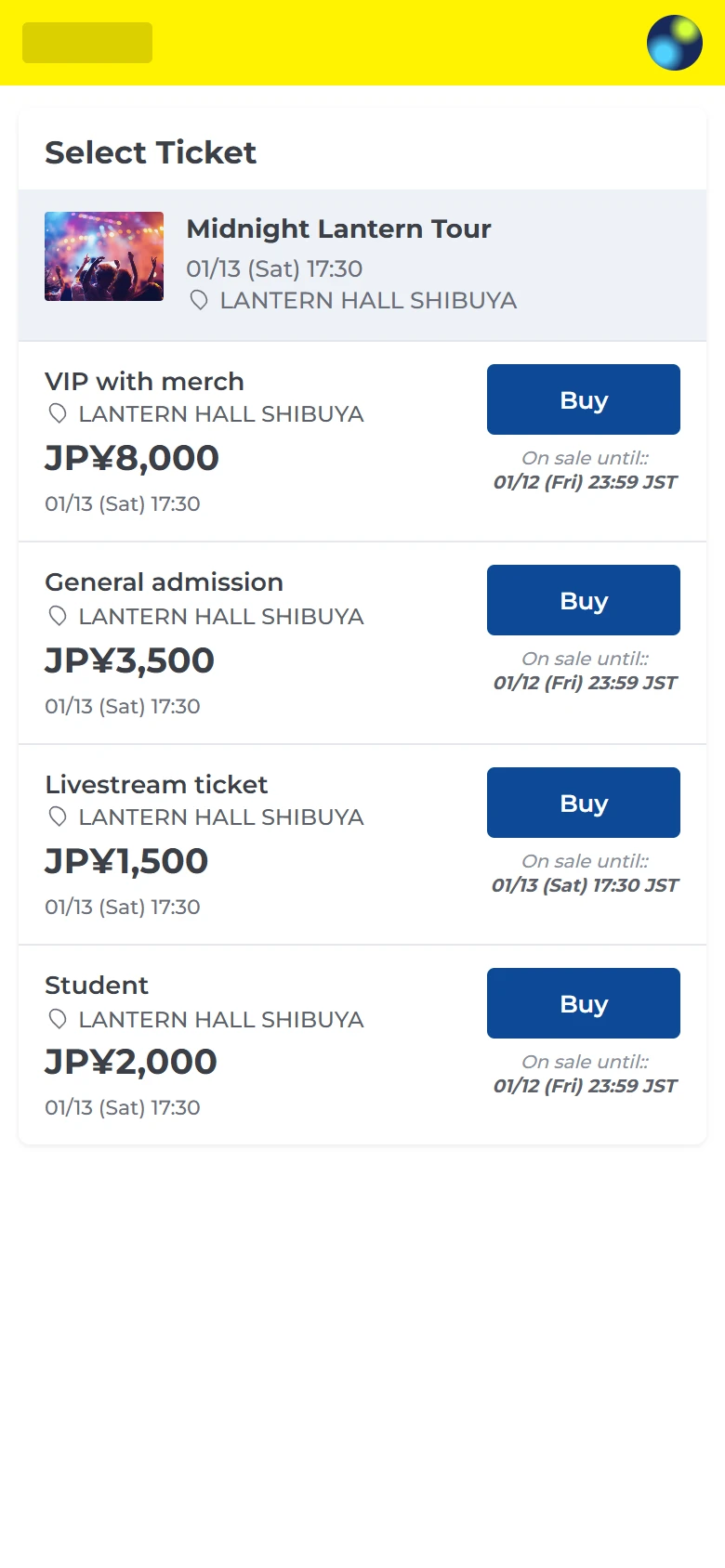 Enlarge image
Before
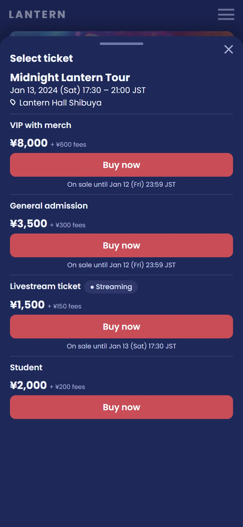 Enlarge image
After
- 1Fees next to each price
Service fees, before and after. The old list showed prices alone; the tested drawer shows the fees next to each price. Redrawn with a fictional event.
Alongside the redesign: upsells
The second checkout step is where upsells live. The same year, as a separate project, I reworked them: adding tipping, so fans can send a donation to the artist, and the option to join a fan subscription while buying a ticket. Because both efforts converge on the same checkout, they reinforced each other: the redesign brought more buyers to checkout, and the improved upsells raised what each of them spent, lifting average order value by about 2%.
Outcome / impact
- +1.5% conversion. In a head-to-head A/B test, the new funnel beat the old one by reducing drop-off. On the flow that carries nearly all of ZAIKO's revenue, that meant measurably more revenue for ZAIKO and for the organisers selling through it.
- +60% search engine traffic within 3 months of launch, measured across hundreds of events. The SEO improvements brought significantly more visitors to event pages, which fed more buyers into the funnel.
- +2% average order value from the upsell improvements on the same checkout.
- A safe launch. The gradual rollout let us move the company's most critical flow to a new stack and design without a risky big-bang release.
- One consistent purchase experience. Buyers now stay in a single design language from event page to payment, and the funnel's components became part of the design system used across ZAIKO's products.
- A/B testing became a practice. These were ZAIKO's first A/B tests, and they changed how product decisions were made.
Reflection
Specs alone don't make a design system stick. During implementation, engineers sometimes adapted existing components instead of building the new ones from the spec. That's a reasonable instinct under deadline pressure, and the results mostly matched, but closing the remaining gaps took extra QA rounds that building from the spec would have avoided, along with some debate about whether that rework was worth it. Next time, I'd invest earlier in advocating for the system with engineers: explaining why each new component differs from what it replaces, so that building from the spec feels like the obvious path rather than extra work.